
Wednesday, June 2, 2010
Excitement Ahead
Well ladies and gentlemen, I graduated! My lease is up in a month so I decided to move to New York for sake of convenience. Plus I really do love NYC. More excitement to come...

Friday, May 7, 2010
New Cards

Just got these in the mail yesterday. I already packed them up in cellophane sheets and they are ready for distribution. Top row is the front, bottom row is the back. This is just the mock-up, the actual cards have rounded corners.
Wednesday, May 5, 2010
Ely
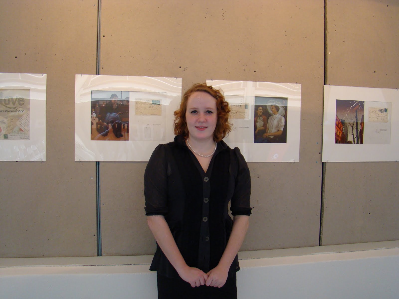
I realize now that I never posted my Ely which is a fancy name for our senior thesis project. I wanted to wait until the very end of it to post it anywhere because it went through so many renovations. I have a collection of about 100 vintage postcards acquired over the past 7 years or so. Each one was selected not because of the picture on the front but for the mysterious messages written on them. This project was intended to visually show my interpretation of the messages written on these postcards. I hope to eventually publish a book of these and more.



Monday, May 3, 2010
Little Match Girl
This was one of two parts for the story of the Little Match Girl by Hans Christian Andersen. For those who don't know the story: a girl is selling matches on New Years. When she doesn't sell any she decides not to go home because her father will beat her. To keep warm she strikes match after match, seeing an inviting hallucination each time. This painting is one of her visions of looking into the window of a rich merchant's home on Christmas. She dies from the blistering cold in the end which will be part two of this series.

Thursday, April 29, 2010
New Yorker and Punk Blues
Well the school year is winding down and tomorrow is my last class before the essays and portfolio reviews. It feels good to have come this far. I'm ready to get out into the business world and make my mark.
 There's about 5 pieces I've been juggling to get finished. Otherwise, about a month ago Tony Auth (a wonderful political cartoonist) came in to teach a workshop on editorial illustration. He assigned for us to make a new yorker cover. I was thinking a lot about commuters and my own daily commute. When you watch crowds submerging in opposite directions they resemble schools of fish, never touching or colliding, always fitting themselves into the wave amongst themselves. So I took a well known new york train station (grand central station) and turned the people into fish, going about their daily commute. Voila! Its a new yorker cover. The image to the left is the version without the binding or the type due to copyright infringement.
I'm very happy with the way it turned out. Originally the fish were rendered and detailed but it became too busy and hard to read. Transforming them into silhouettes fixed the problem.
The next image is a zine cover I did as a creative project for my blues class. It was hard to decide what symbol to use for "punk" so I decided to go with a simple safety pin to let people decide for themselves what punk is, because I couldn't tell you. Robert Johnson is an obvious choice for a symbol of the blues. This is basically a zine that is going to house my final essay for the class. Art school really is a blast, I am going to miss it.
Both images are blue and brown completely by accident.
 There's about 5 pieces I've been juggling to get finished. Otherwise, about a month ago Tony Auth (a wonderful political cartoonist) came in to teach a workshop on editorial illustration. He assigned for us to make a new yorker cover. I was thinking a lot about commuters and my own daily commute. When you watch crowds submerging in opposite directions they resemble schools of fish, never touching or colliding, always fitting themselves into the wave amongst themselves. So I took a well known new york train station (grand central station) and turned the people into fish, going about their daily commute. Voila! Its a new yorker cover. The image to the left is the version without the binding or the type due to copyright infringement.
I'm very happy with the way it turned out. Originally the fish were rendered and detailed but it became too busy and hard to read. Transforming them into silhouettes fixed the problem.
The next image is a zine cover I did as a creative project for my blues class. It was hard to decide what symbol to use for "punk" so I decided to go with a simple safety pin to let people decide for themselves what punk is, because I couldn't tell you. Robert Johnson is an obvious choice for a symbol of the blues. This is basically a zine that is going to house my final essay for the class. Art school really is a blast, I am going to miss it.

Both images are blue and brown completely by accident.
Thursday, April 15, 2010
Too Many Sketches
...or is there such thing?
I feel like I haven't posted in a while so I wanted to let everyone know what I've been up to. For some reason every project for every class started at the same time, including a freelancing job. The work I was doing was all sketching night after night. Finally I get to do some fun stuff (aka finished paintings) so I'm very ecstatic about that. Once I have finalized some of them I plan on posting them for your viewing pleasure.
Otherwise, I just received my postcards in the mail. I am not happy with overnightprints.com. First of all, I opened the package and they were just loosely thrown in with no security, bouncing around risking damage. Second, the picture side of the postcards had streaks through the image which is a sign that they didn't line up their ink cartridges properly. I took the risk of digital prints and will probably never opt for the cheaper alternative again. Luckily I only ordered 50 prints rather than large shipments like I normally do.
I think I will stick with premiumcards.net. It takes longer to ship because they are in LA but it is totally worth it. The prints are spectacular. Plus they are very nice on the phone. Hopefully this review helps some people out with choosing a printer for business cards and postcards. I am sure there's lots of good printers out there, I'm just sharing my experience with these two.
Sorry no pictures. Next time!
I feel like I haven't posted in a while so I wanted to let everyone know what I've been up to. For some reason every project for every class started at the same time, including a freelancing job. The work I was doing was all sketching night after night. Finally I get to do some fun stuff (aka finished paintings) so I'm very ecstatic about that. Once I have finalized some of them I plan on posting them for your viewing pleasure.
Otherwise, I just received my postcards in the mail. I am not happy with overnightprints.com. First of all, I opened the package and they were just loosely thrown in with no security, bouncing around risking damage. Second, the picture side of the postcards had streaks through the image which is a sign that they didn't line up their ink cartridges properly. I took the risk of digital prints and will probably never opt for the cheaper alternative again. Luckily I only ordered 50 prints rather than large shipments like I normally do.
I think I will stick with premiumcards.net. It takes longer to ship because they are in LA but it is totally worth it. The prints are spectacular. Plus they are very nice on the phone. Hopefully this review helps some people out with choosing a printer for business cards and postcards. I am sure there's lots of good printers out there, I'm just sharing my experience with these two.
Sorry no pictures. Next time!
Monday, March 29, 2010
Mad Hatter

Well Hawllo. This weekend I took a break from my busy life to celebrate my birthday.
Friday: dinner party, including asian goodies and cake
Saturday: much needed sleep
Sunday: sushi and frozen yogurt courtesy of my wonderful boyfriend, Kei.
So now back to business. Tonight I printed out a couple of portfolio pieces for Tuesday when people working in different illustration fields come to my school to chat. This is one of the illustrations I put in my folio. It is an editorial piece to accompany a bad review for Tim Burton's Alice in Wonderland. It is Johnny Depp as the mad hatter sitting in a coffee shop in the real world. I finished it about a week ago and it is the last traditional oil painting I plan on doing for a while.
Speaking of printing, we just bought a new printer. We named our Epson 1400 "Audrey" because we love it that much.
Subscribe to:
Posts (Atom)
